Seemingly simple things, like placing a front door in the 'right' place, can unlock wider urban benefits for both a city and the cultural institution it inhabits.
The future of the Sainsbury Wing at the National Gallery, London, has taken to the headlines just as it did more than thirty years after it first provoked debate. The debate raises meaningful questions not just about heritage, and particularly that of the 20th century, but of how a museum, or more broadly any cultural institution with a public mission, engages with the city.
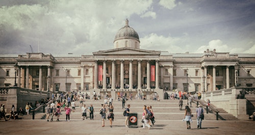
Founded in 1824, The National Gallery has been in its Trafalgar Square setting since the 1830s. In the time since it grew incrementally in its locale, adding to the William Wilkins original through subsequent additions. Throughout much of this history, the Gallery maintained a presence alongside the public piazza in front of it, with an entrance along its centreline. The latest addition was the Sainsbury Wing, designed by Venturi Scott Brown.
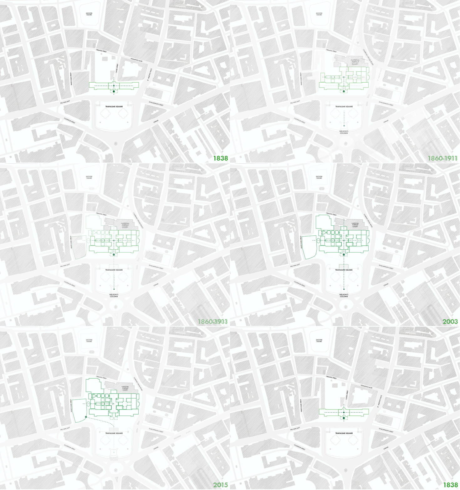
Mapping three centuries of evolution of the National Gallery and its Trafalgar Square setting reveals that it was only until the early 2000s when the main entrance to the gallery shifted off the square.
Opened in 1991, that new addition was one of the first buildings of its time to have achieved a Grade I listing. The only Venturi building in the UK, the Sainsbury Wing is rich in architectural pedigree and reference, embodying many of the ideas of complexity and contradiction which the Venturis championed in their Modernist counter-revolution. The Wing was originally commissioned as an extension, a supporting character to the wider whole of a global museum. Its orientation is to the western side of the main gallery tucked slightly offside Trafalgar Square. Yet, in the time since, the wing took on the role of the main entrance to the Gallery as a whole.
There are millions more visitors now and museums of this kind today rightly focus on inclusivity, accessibility, openness. The world around it has changed too. But as any regular passer-by can attest, there are long queues and slightly befuddled tourists outside its doors, and the Gallery has come to see it as in need of an upgrade. So, a refurbishment of the Sainsbury Wing is underway yet the new main entrance will remain there.
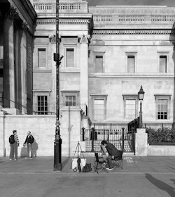
Closed off, Wilkins Portico, National Gallery
A Gallery and its Square
Yet should it remain the main entrance? Is it the most urbanistic thing to do? Many of those confused tourists arrive at the base of the portico to find locked gates and redirects to the Sainsbury Wing. There is an opportunity to reinstate the Gallery's principal entrance to the portico on the Wilkins building along the centreline of the great square, its natural stage set. Restoring this axis would create a more obvious entrance. It could allow the Gallery to handle a greater capacity of visitors. It would enhance the visibility of and access to revenue-generating spaces. It is also an opportunity for the Gallery to more generously engage with the public realm around it.
At our own initiative, we have explored how this could work, studying different permutations. One approach would be to place an entrance beneath Wilkins' portico, utilising the Gallery's undercroft spaces to carve out a new entrance that scoops visitors in. This could be achieved as a simple incision into the portico in the form of a wide, new front door; or more emphatically by placing an entrance pavilion into the public realm immediately in front of the portico.
A second approach would be to bring people in at the top of the portico base, into Level 1 of the Gallery. We have explored two different forms of this, one more subtle, the other more dramatic. The subtle option imagines hugging the portico with new wraparound stairs; the dramatic, a generous rippling out of stairs and ramps that blends into the expanse of Trafalgar Square. Both could accommodate generous glazed lifts for visitors.
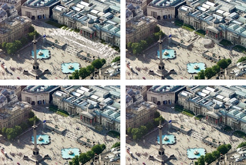
The left two images visualise Trafalgar Square entrance options at portico level, achieved as stairs rippling out into the public realm (top) or more subtly by opening up the existing staircases to public use (bottom). The right two images imagine entrance options within the undercroft of the same portico, either through a new pavilion in the square (top) or as a new front door placed within the portico base (bottom).
All the permutations we explored account for wheelchair and disabled access. They are respectful of the main elevation and are responsive to the inner workings of the Wilkins building, which are primed to support the arrival spaces (reception, ticketing, shop and an overall sense of welcome) as they did in previous generations.
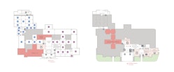
Simulations of the National Gallery internal workings with a new portico entrance (left) or undercroft entrance (right). Each scenario would also help to create an internal space for welcome upon entry, and each could accommodate internal lifts for accessibility.
In these scenarios, there could be two entrances: a primary Trafalgar entrance with the Sainsbury Wing as a secondary, additional way in and out. Each would offer a more memorable welcome and more options for welcome. They would also allow for a second life for the Sainsbury Wing as an annexe within a wider rework of a great museum. The Sainsbury Wing is a valued artefact, arguably the most significant part of the Gallery's estate - from the perspective of the architectural historian. One reason to speculate why this approach may not have been considered is the chronological sequence of the art contained across the length of the Gallery. But rather than look inward, a public institution could look out and embrace the cityscape around it.
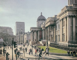
Portico approach: One scenario of opening up the staircases around the Wilkins' portico. The Sainsbury Wing, visible to the left in the middle ground, could remain as a secondary entrance.
Look out, not (just) in
With the profile of its location and as a hinge between Trafalgar and Leicester Squares, two of our city's most important public spaces, the National Gallery has a unique urban role to play. A national museum is a necessarily public building. It may have a global profile, but its first responsibility is to its locality as it shapes the social and physical fabric of its surroundings. Through working with cultural institutions and their buildings, we are interested in how design can nurture the bond between city and cultural programme by blurring boundaries between the two, by urbanising these buildings in both macro and micro ways, from the scale of a single gallery entrance to London's most popular riverfront space. Our experience at Southbank Centre, and more recently, the Barbican Centre, has been very much about opening up these spaces to the city.
Seemingly small, surgical interventions in the 'right' place can yield significant wider urban benefits. At London's Southbank, the major restoration project for the Royal Festival Hall required a deep understanding not just of the concert hall but its urban setting too, as over the decades it had become cut off from the city around. The project gave an international performance venue a more public face by converting a riverside undercroft service area into new retail and restaurant spaces with landscaping rippling out to the river. It provided Southbank Centre with a welcome stream of revenue, and it quickly became a new destination of Londoners and visitors alike.
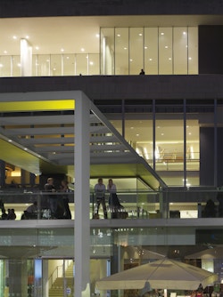
Looking out, Royal Festival Hall, Southbank
Onsite now, at East Bank, four cultural/educational institutions are being brought together. Their architecture intentionally looks out. They share a common domain which has been designed to enable stickiness, to not just facilitate the movement of people through and into the institutions, but to add opportunities for visitors to stick around - to sit, to sunbathe, to get some fresh air. A topographic, multi-layered sequence of spaces will invite occupation and a relationship with its parkside/waterside edge as well as porosity with and between the institutions themselves.
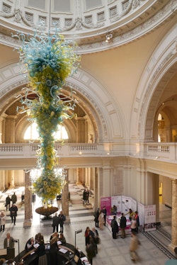
Welcoming in, Cromwell Road Entrance, V&A
Think of the Metropolitan Museum of Art's staircase which brings visitors into a Grand Central Station of art, full of people, airy halls leading off to the ancients, to abstract expressionism, to fashion, the shops, the loos, all off one great internal piazza. It is a scenario echoed in London in places such as the V&A, which has multiple entrances.
With its need to expand audience and play a more engaging role with the public at large, a 21st century museum wants to be in more direct dialogue with its neighbourhood. The city around can benefit from a welcoming front door - and more ways in.
Undercroft approach: Placing a front door beneath the Wilkins portico.