London College of Fashion
View all projectsFashion forward
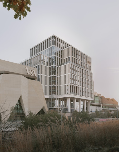
This new home for UAL's London College of Fashion is conceived as a 21st century workshop; its design inspired by 19th century mill buildings common to many industrial cities. It is outwardly simple, unpretentious and robust while capable of containing multiple complex and process-driven internal arrangements that are continually adaptable to change. Bringing together an institution that up until recently was operating in six sites across London, this move represents the first time that all of its departments co-locate together under one roof. Now occupied by 5,000 students and faculty, the building is one of the largest dedicated to the study and research of fashion in the world and forms a key piece of the cultural quarter of East Bank.
Context
The origins of the college lie in the trade schools founded at the beginning of the 20th century to meet the increasing needs and new technologies of the textile and clothing industries. Traditional courses such as footwear design and pattern cutting have more recently been joined by fashion journalism, management, and marketing. The College’s departments were dotted across London – from the bustle of Hackney’s Mare Street to a quiet corner of Lime Grove.
Housing such a variety and diverse character of disciplines in one place represents a step change in the functional organisation of the college and the opportunity for London College of Fashion (LCF) to take on a more tangible identity for itself and for its students.
The new college building was commissioned as part of Stratford Waterfront, an important piece of post-Olympic legacy to create a new education and culture quarter within Queen Elizabeth Olympic Park. Allies and Morrison was masterplanner for the site and alongside the LCF has also designed a new home for BBC Music. The location demanded a building of character – with an identity appropriate to its context within the ‘terrace’ of new institutional buildings, and recognisable as a facility for the production of fashion.
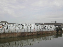
From fridges to frocks; on what was once a post-industrial dumping ground now sits a world-leading campus for creative education.
Challenge
This was a building commission with three ‘clients’ in effect, each with their own focus and priorities, each needing to be addressed. Firstly, the London Legacy Development Corporation (LLDC) as the overall steward of Queen Elizabeth Olympic Park, focussed on the urban role and the interface with the public realm and park; then, the University of the Arts London (UAL), of which LCF is one of six constituent colleges, as the landlord, focussed on the long term value of the asset – its flexibility and adaptability to change, its robustness and ease to maintain, key decisions on storey heights, and carbon. And thirdly, the faculty and staff of LCF: The building’s users – focussed on the experience of the student, of the here and now, the collective and the institution. how the building is used, how interdisciplinary and social interaction benefit all.
As well as a broadening curriculum, LCF like other higher education institutions has seen changes in ways of learning and teaching practice and a growing emphasis on cross-disciplinary practice and creative collaboration. While non-specialised space with flexibility and capacity for change was therefore fundamental to the brief, LCF’s creative, practice-based making courses retain requirements for spaces equipped with machinery and specialist equipment.
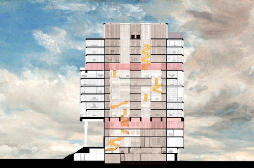
lecture theatre
library
public floors
fashion business school
shared atria
3D + performance
garment hub + sample rooms
Millinery + accessorises
embroidery craft
Concept
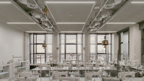
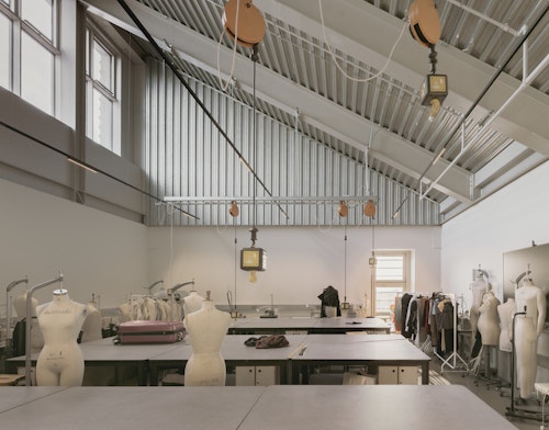
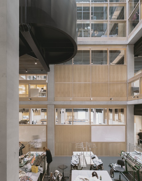
Before we embarked on a design, the architecture team visited the various buildings that were hosting the LCF before it moved to Stratford. Several of the workshop spaces we discovered had a particular impact, each with a distinct atmosphere that arises from spaces where things are actually made. We were inspired by both the spaces - their functionality, adaptability - as well as the ordered productivity they encouraged.
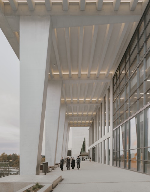
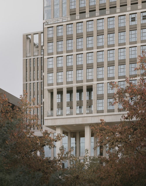
In response we looked at the 19th century factory and warehouse buildings common to many industrial cities – spaces capable of use and re-use, with long histories of creativity and production. Their outwardly simple, unpretentious and robust architecture feels at home in this part of east London once characterised by factories and industry. The key attributes of these buildings - lofty, solid, well lit, simple and adaptable spaces – characteristics for which they are highly rated by makers and artists repurposing them in the 21st century, were exactly the requirements for the workshops and studios that make up a large part of the new building.
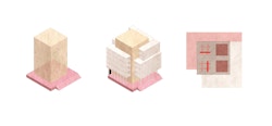
the heart space
the workshops
typical floor plan
Process
The building operates like a vertical campus bringing together a diverse range of functions and typologies across 17 floors.
Needing to accommodate, and be appropriately scaled, for both individual work and larger group activities and fully exploit the benefits of bringing all departments together, the circulation and shared spaces at the heart of the building’s organisation were designed to actively encourage planned and incidental interaction, exploration and a sense of shared identity.
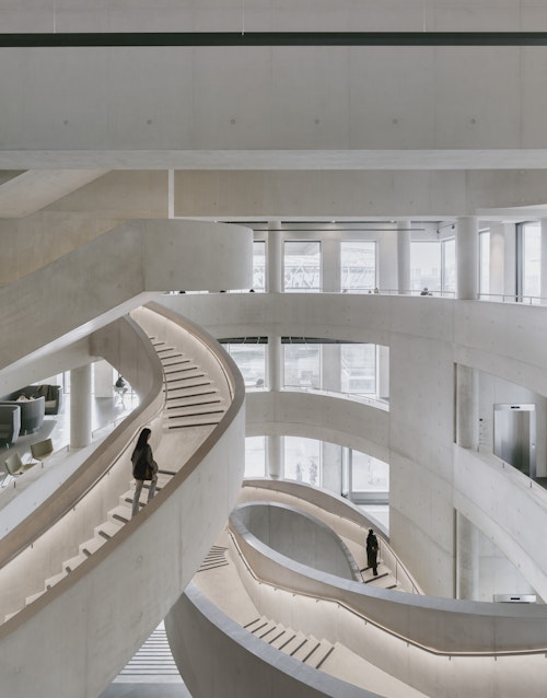
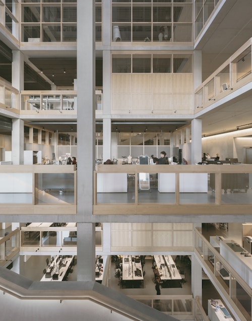
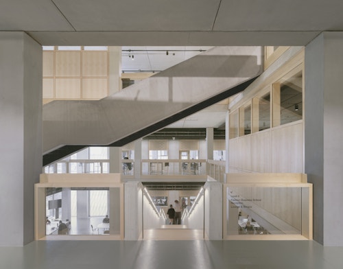
Square in plan, the building’s structural stability derives from a simple rectilinear column grid that delineates a central circulation route. At this ‘heart’ are the building’s fixed elements: vertical circulation; lifts; and WCs. In cross-section, through the layering of different configurations, the heart becomes a singular, yet ever changing, interconnected vertical space that links the building’s generous entrance hall and public functions at its lower levels – the auditorium, gallery, cafe and library – to the workshop and teaching floors at its middle and the refectory, drawings studios, roof terraces and support functions at its upper levels.
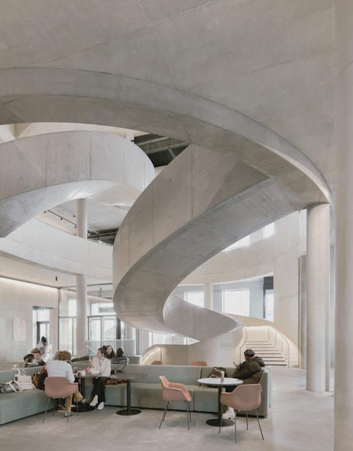
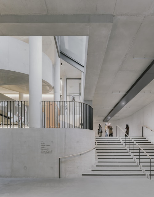
Through this heart travel the stairs: At the publicly accessible lower levels these are generous, expansive and sculptural, unfurling like orange peel to create a dramatic vertical catwalk to see and be seen. At the upper floors they are simpler, made of steel, but with openings that provide visual and physical connectivity between faculties as well as natural light and ventilation to the centre of the plan. At every level they allow the visitor to understand where they are in the building. The generosity of circulation (from the width of lift core to the leaning ledge to voids) actively encourages interaction.
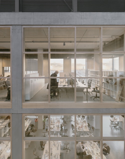
Flexible and adaptable workspaces are located around the perimeter of the floorplate. They vary in depth of plan, and because their partitions are lightweight and non-load bearing, are capable of future reconfiguration without impact to the building’s organisational diagram. Their tall, repeating, factory-warehouse like windows give the building its distinctive and robust character.
The material palette is simple and muted – concrete, timber, black metal – with a consistency of detailing to all elements that, while complex and rigorous, enables the informal character of students and their activities to take centre stage.
Each of the three materials performs a distinct function: Concrete is the robust structural skeleton, timber (a warm maple) provides the tactile elements of the building (doors, screens, balustrades, fixed furniture, handrails), and dark metal accommodates services (power, information, drainage).
Impact
The college opened its doors for students for the 2023-24 academic year. Initial feedback has been positive – “the students seem thrilled” notes The Guardian. For an institution where previously courses and departments were spread across multiple sites, the college’s visibility has only started to begin a new era of enhancement. It also means that a student body, who previously did not have a shared experience or sense of belonging, now do.
As the college’s ‘forever home’, the new building provides a place that has long life, robust yet flexible, a fitting backdrop to the colour of fashion and the charisma of its creators.
Information table
- City
- London E20
- Use
- Education
- Client
- University of the Arts London, London Legacy Development Corporation
- Status
- Completed
- Size
- 41,200 sqm
- Environmental credentials
- BREEAM Outstanding, Biodiversity Net Gain: 107%
- Awards
RIBA Stirling Shortlist 2025, RIBA National Award 2025, RIBA London Award 2025, Architizer A+Award 2025 (Architecture+Concrete category), Education Estates Awards 2025 Project of the Year – Universities, AJ Architecture Awards 2025, New London Awards 2025, Commended,
Civic Trust Awards 2025.- Collaborators
Structure: Buro Happold
Services: Buro Happold
Facade: Buro Happold
Landscape: LDA Design
Acoustics: Buro Happold
Cost: Gardiner & Theobald
Lighting: Buro Happold
LLDC Construction Manager: Mace
